This weekend I decided to learn more about twitter and its handy API. My subject of the analysis is Artsy, a fine-art website that provides a pandora-like service. The subjects I was curious to find out are where their followers are from, what their twitter activities are like, what other interests they have, and, specifically, what kind of stereotypes clusters they fall into because, you know, it’s important and I didn’t have anything better to do.
Data Collection
I used Python to collect all the data for the analysis. Before deciding on Python, I also tried R using the twitteR package. However, after playing around with both for a while, it seemed to me the Python solution is more robust and I was able to find a lot of resources and tutorials online. Particularly, I found this O’Reilly book titled “Mining the Social Web” very helpful, specifically Chapter 9, “Twitter Cookbook,” which, along with all the example code, can be read and accessed for free on the book’s website – isn’t open source awesome?
To start, I first pulled all the twitter IDs of those who follow Artsy, which, as of 5/5/14, amounted to a whopping 85,000. To prevent robotic scraping, twitter caps the number of requests one can make in one batch, and once the limit is met, one needs to wait for a minimum of 15 minutes before starting again. Because of that, the whole process took about an hour.
After retrieving all the follower IDs, my next step is to use them as the key to pull the actual user profile, which include information such as name, description (i.e., bio), location, and the number of friends and followers. They are the primary data for this analysis. This step took about an hour and a half.
Finally, the last piece I was interested in is a list of these followers’ friends in addition to Artsy, which seems to me a good proxy for these users’ interests and hobbies (e.g., if it turns out that most followers also follow a lot of musicians, they may also be music-lovers). However, this is a huge project: Artsy has ~85,000 followers in total, and each follower has ~1,000 friends on average. Together, it means 85 million user profiles to download! I didn’t want to abuse my laptop that way so I decided to sample. In the end, I pulled the profiles for the friends of 300 followers and, for each of them, I pulled at most 1,000 friends. As a result, I got at most 300,000 profiles of the followers’ friends.
Data Analysis
Finally, R time!
The first analysis I did was to analyze the geographic distribution of these followers. Below is a heat map I created with darker blue indicating countries with more followers and lighter blue indicating fewer. Note I did not show countries with 0 follower in order to not distort the calculation of the quantiles (as there are quite a lot of them). My primary resource / reference for this task are the Data Science Toolkit (link) for mapping the twitter locations to the standardized country names ([update] another approach is probably to use the spatial mapping) and “R Graphics Cookbook” (link) and this awesome stackoverflow post (link) for making the chart.
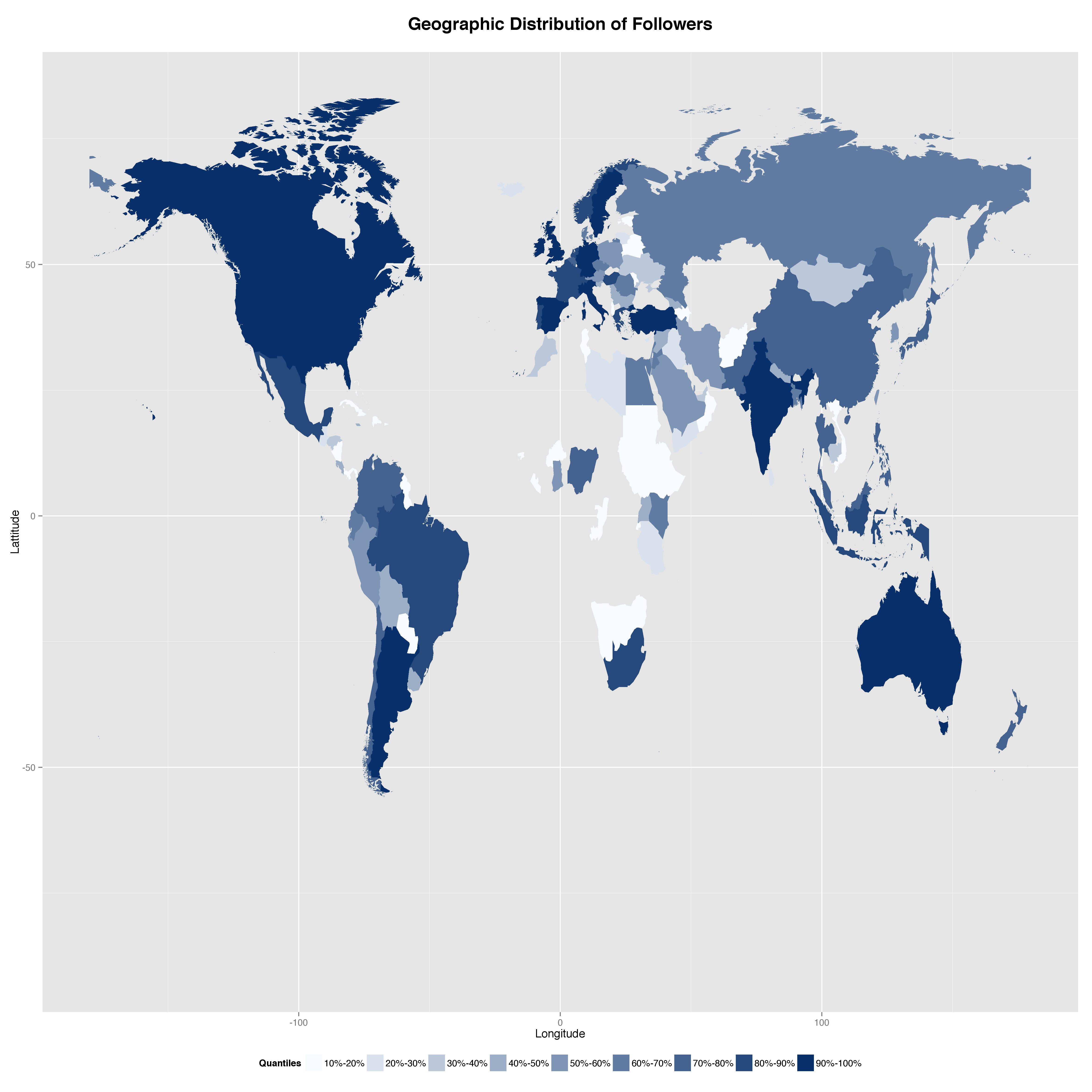
As we can see, Artsy’s followers are located all over the world. Specifically, the U.S., Canada, Australia, and many European countries share the top 10 percentile. Notably, China also made it to the top 30 percentile despite that twitter is blocked over there!
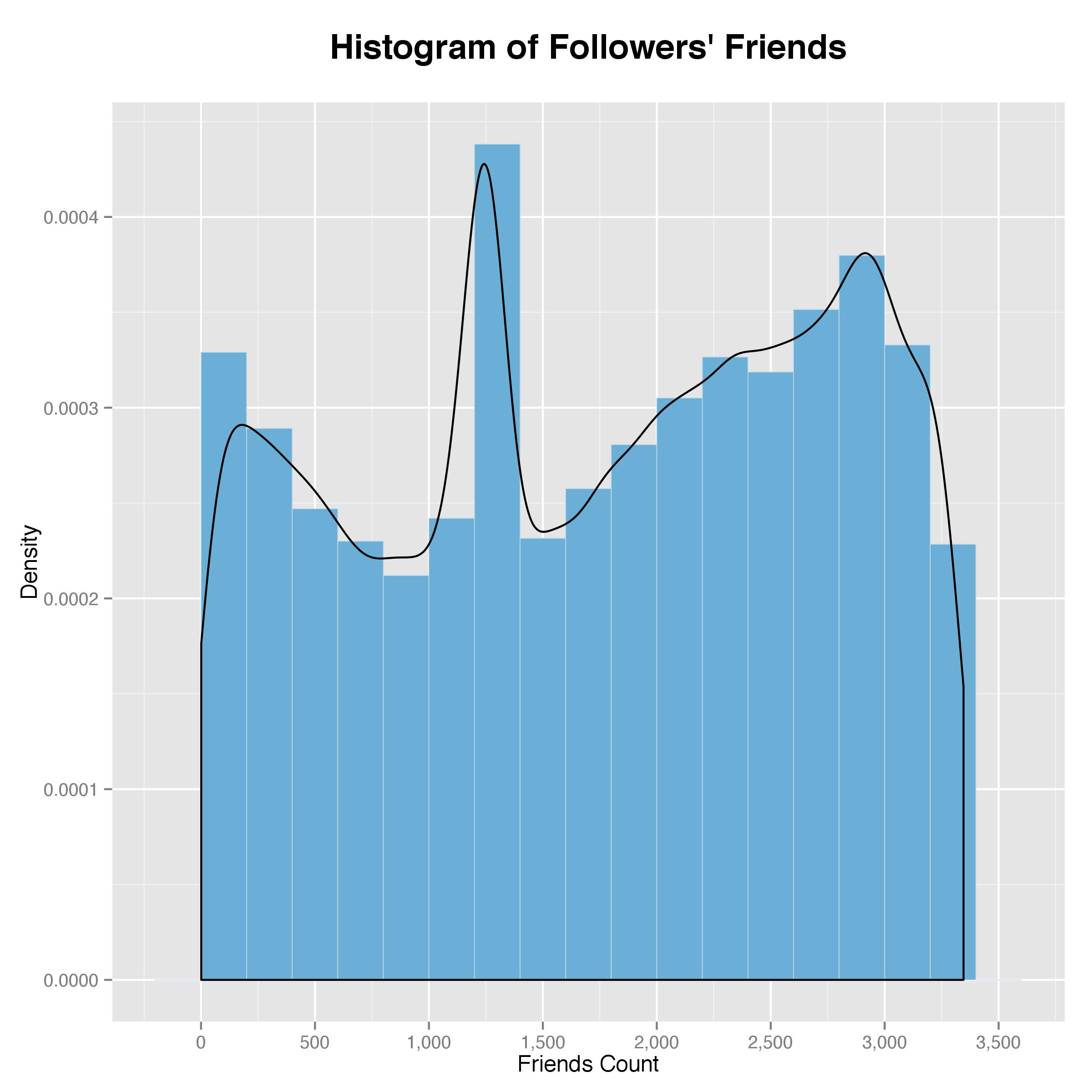
Now let’s look at these followers’ friend count and follower count. Intuitively, a user with many friends indicates that he/she is an active or “seasoned” twitter user, and a user with many followers indicates that he/she is probably an influential user. First, a histogram showing the followers’ friend count:
Then the followers’ follower count:
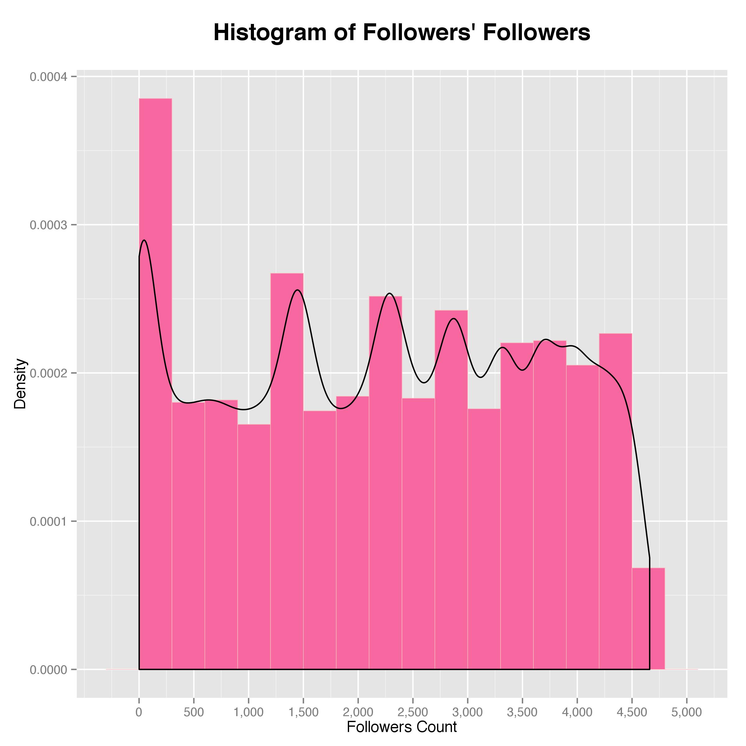
As shown by the density plot on top of the histogram, the friend count peaks at around 1,300 with another spur on the higher end at around 3,000, which implies that Artsy’s followers also follow many other accounts and are, therefore, quite active on twitter. As for the follower count, it is closer to what I expected in that it peaks at the lower end and gradually flattens out. However, it is somewhat a long tail, implying that many of the followers have a decent number of followers and are very influential themselves as well.
Lastly, let’s look at the twitter ages of these followers. To do that, I parsed the age (in days) using the account creation date and plotted the histogram below.
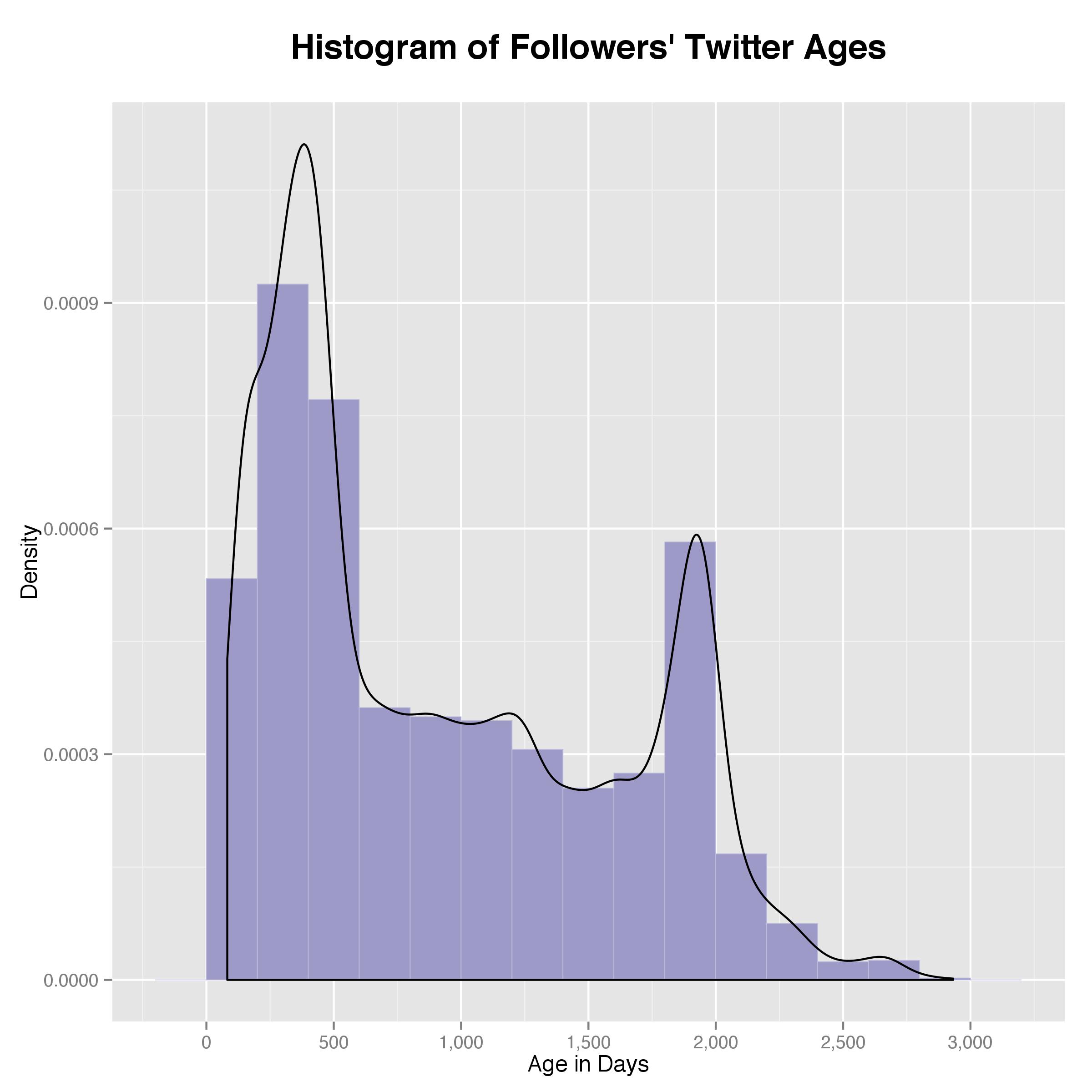
As it turned out, most followers are quite “young” in twitter age, usually close to one year, potentially implying that Artsy was among the first few accounts they followed. However, I wouldn’t go ahead and assume their real age based on this because they might be either very young and new to social media or very old and new to social media. Either way, as new adopters, it is possible they are also active users.
Let’s move on to analyzing the followers’ friends. For this piece, I was curious to see who the common friends are in hope to gain some insights into Artsy’s followers’ general interests. To do that, I first merged the followers with their friends and align them side by side so that Gephi can recognize each row as a network edge (i.e., follower -> friend). After feeding the data to Gephi, I chose to rank each node per “in-degree,” which is the number of edges that end in a particular node. In my case, more in-degrees mean more followers for a particular account. The ranking is visualized by the label size. Below is the graph (note to better present the top accounts, I limited the data to only include friends that have at least 300 followers, which in my dataset gives me the top 19; note also I excluded Artsy itself, which would have been the biggest node):
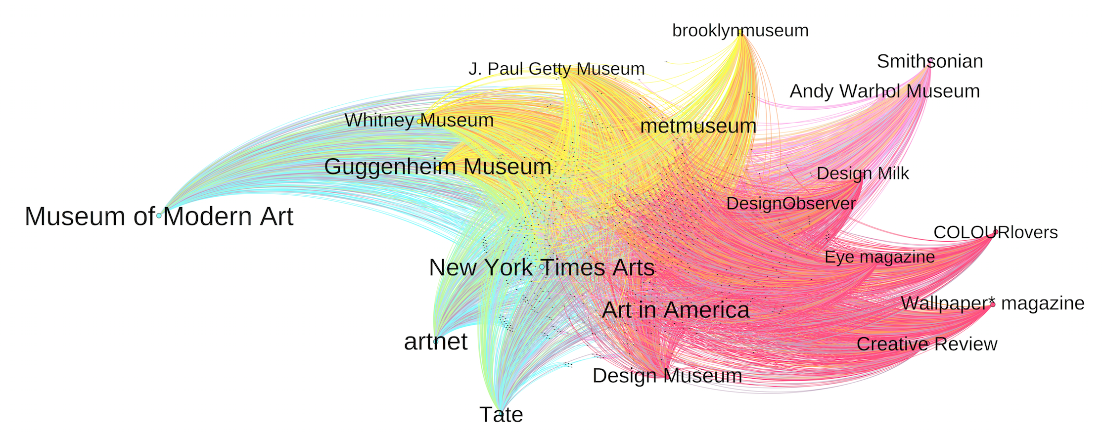
As we can see, the followers of Artsy are real art lovers as their top friends are all museums or galleries. In addition, the color of the edges represents the cluster that each user Gephi assigns to. In this case, Gephi identified four clusters based on the common friends among followers. [update] to be honest, I didn’t need to use Gephi to do that – I could’ve simply tabled the results up, but I was looking for an interesting dataset to use Gephi with, so there you have it.
[update on 7/13/14]
Inspired by this analysis performed by thetwoweeker, I decided to do more with the data I have. First, I tried to infer the gender of the followers based on their names (not the screen name). In order to do that, I first crawled the top 1,000 English names as of 2000 and 2010 from the social security website and kept the unique male and female names from the 2 lists. Then I matched them against the first names extracted from the followers’ names. Obviously, there were a lot of mismatches, but, out of the 85,000 followers, I was lucky enough to match 45,000 of them. Using these samples, I was able to get a decent picture of the gender distribution, as shown below:
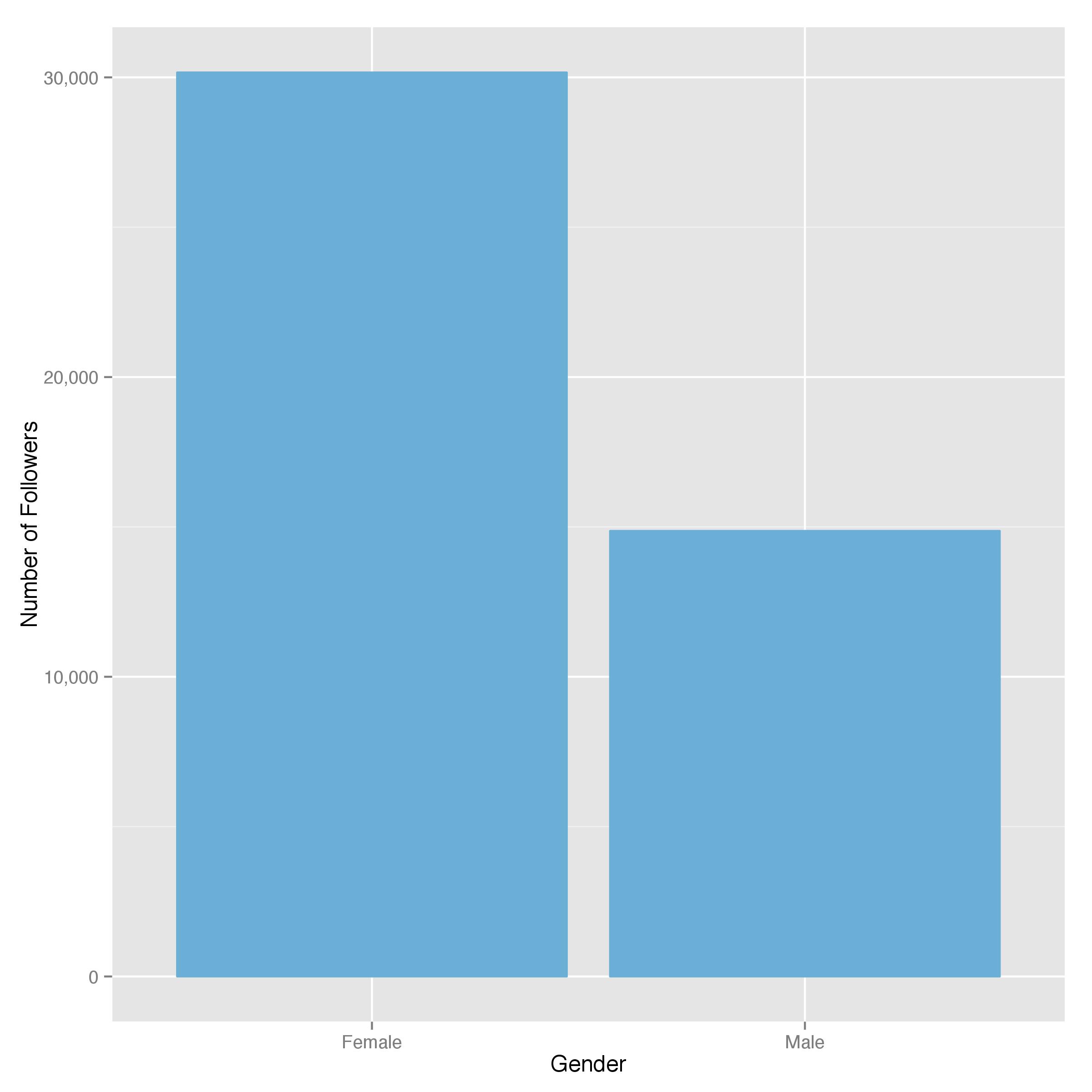
Perhaps not surprisingly, most of the followers are ladies. But who are these people exactly? My resources to tell that is quite limited. Here, inspired by thetwoweeker’s post linked above, I parsed out all the words these people used to describe themselves in their bio, and made a word cloud out of them. Here is what it looks like:

As it turns out, most of these people don’t just follow Artsy on a whim – they also used “art” and art-related phrases to describe themselves. This seems to me a further indication that they are real art-lovers or creative professionals. (funny “gmail” is also one of the common terms – really? Some people just put their email addresses on twitter? What if someone like me crawled them down?)
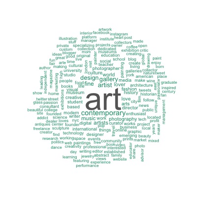
Finally, let’s do some clustering to see if we can separate them and understand them better. In terms of measuring distance in the clustering algorithms, thetwoweeker makes a very good point that spherical k-means serves as a better distance metric than euclidean distance when it comes to text mapping. Therefore, after creating a document term matrix made of all the non-empty bios, I fed it directly into the skmeans function included in the skmeans package, and created 4 clusters (a result of trial and error). Below are the word clouds created using the words from the bios in these 4 clusters:
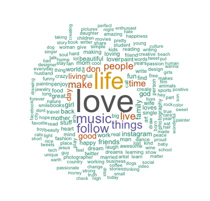


Starting from the top left, the first cluster is interesting in that the subjects (or the nouns) do not have any overarching themes, but the algorithm groups them together because of the common use of “love.” After reading more of these words, I also found many other positive terms such as “enjoy,” “good,” “fun,” and “beautiful.” Therefore, in lack of a better term, I define them as people who love everything.
On the top right, we get a clear big “artist.” In addition, “painter” and “designer” also popped up. Thus, I say these people are (self-proclaimed) artists.
On the bottom left, the common term is “art.” Zooming in also reveals words such as “contemporary” and “fine.” Hence, I think it’s safe to say they are art-lovers.
The last cloud is also interesting. First of all, it looks a bit funny as compared to the other 3 because a lot of the terms are equally common and the program ran out of space to include them all. Looking at the words themselves, I found that, despite not specifically mentioning art or being an artist, many of them are related to art professions (e.g., designer, photographer, and writer). In addition, we also see mentions of “student” and “education.” Therefore, I call them creative professionals and art students.
How many of Artsy’s followers fall under each bucket? Well, let’s see:
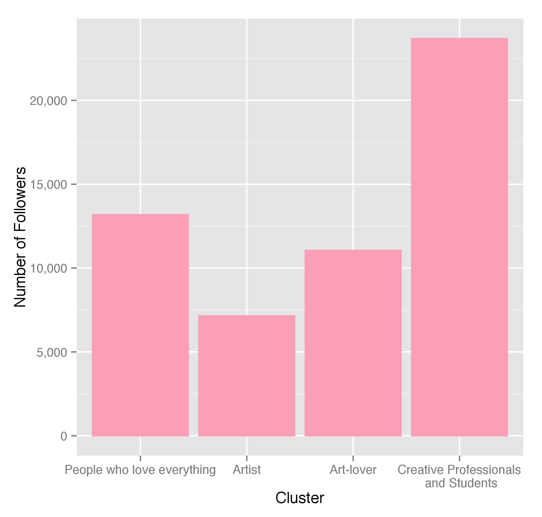
As it turns out, most of the people are art professionals and art students. Sadly, the real artists are quite few, but, hey, maybe most people are just modest!
Conclusion
Twitter is fun and Artsy has an impressively large group of followers. They come from all over the world, very active on twitter and museums, mostly ladies, and mostly art professionals. I would say the company is targeting the right audience, but they probably have already known that.